

If you've worked with Contentful before, you are probably familiar with the power of their Images API. If you haven't, it's worth checking out.
While Contentful itself has a lot of great features, how it manages images is one of the coolest. First of all, all images (up to a certain size) are compressed once they are uploaded to Contentful. Secondly, like all the other content on Contentful, it leverages its content delivery network (CDN) for quick access. Third, accessing those images via their API provides lots of features. Some of those include:
- Specifying Image Format
- Resizing and Cropping
- Changing Quality
- Specifying Focus Areas
All these can be done on a per request. Not only that, once you make that request, the updated image is stored in their CDN for future requests.
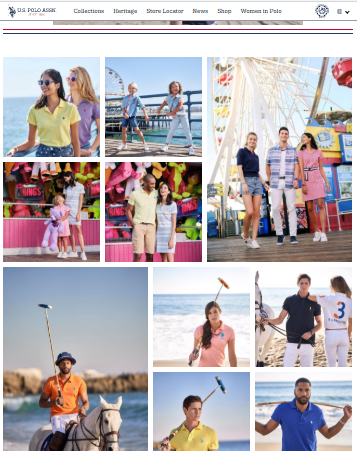
Leveraging all these features can help you create a really awesome image gallery. We did just that for the U.S. Polo Association, and we wanted to share some of the features we leveraged from Contentful to do it. You can check out the full implementation in gallery.js
Implementation
The first section of our code is the setup. We grab the container element for rendering our gallery, we grab all image URLs that we added to the page in .Collection-item, and we get the resolution of the device the gallery will be rendering on.
const galleryContainer = el
const galleryItems = [].slice.call(galleryContainer.querySelectorAll('.Collection-item'))
const resolution = window.devicePixelRatio
Next, we build the call to Contentful's Images API. Here we need to do some basic calculations. Based on the resolution we got above, we calculate the needed height and width of the image. First, detect the size of each grid cell as rendered on the client side browser. Then, we multiply the height and width of each cell by the users resolution. By specifying the exact size required for each image, we maximize our performance by avoiding loading any unnecessarily large images.
let entry = lazyImage
let imageWidth = Math.round(entry.offsetWidth * resolution)
let imageHeight = Math.round(entry.offsetHeight * resolution)
let imagePath = `${entry.dataset.img}?fit=fill&w=${imageWidth}&h=${imageHeight}&f=faces&q=75`
let imageAlt = entry.dataset.alt
let galleryImage = document.createElement('img')
We add this to the URL using the w & h query string parameters. We also add one for q, which specifies the quality. We put this at 75, meaning we want the image at 75% of its original quality. This could vary depending on implementation, but the images we worked with for U.S. Polo were all very high quality. So we were able to request a lower quality image without it affecting the end result.
One thing you will notice for our query is that we also added f=faces. This is leveraging the "Specifying Focus Area" feature I mentioned above. When you add this, the Images API will use machine learning to focus on any faces it detects in the image. This is perfect for our situation where we are leveraging images that all feature people in them.
The last feature to call out is how we update our gallery as the screen size changes.
// Reinit the photos when the media query changes from/to mobile, tablet, desktop.
// BREAKPOINT.MEDIUM.MIN === 769
window.matchMedia(`(min-width: ${BREAKPOINT.MEDIUM.MIN}px)`).onchange = () => {
init(document.querySelector('[data-ondemand="gallery"]'), true)
}
// BREAKPOINT.LARGE.MIN === 1440
window.matchMedia(`(min-width: ${BREAKPOINT.LARGE.MIN}px)`).onchange = () => {
init(document.querySelector('[data-ondemand="gallery"]'), true)
}
Because our images are lazy-loaded, the screen size may change before the user gets to a point on the page where all images are loaded. If that's the case, we will want to update the image requests to work with the new screen size. This will re-call our gallery code, and make the API calls with the updated height and width.
Final Thoughts
And that's it! It's pretty basic, but that's just a testament to the functionality of Contentful's Images API. Whether you're new to Contentful or a seasoned veteran, I hope you found this tutorial interesting.
And I hope you check out our implementation on U.S. Polo Association. If you have any questions regarding the gallery.js code, or questions about Contentful in general, feel free to reach out to us on Twitter.


